Triple A Security
A self-initiated logo design project for a security consultancy company.
Behind the project
‘Triple-A Security’ is a fictional security company that specialises in providing services across three domains: the physical space, digital space, and personal security.
They provide services to businesses and individuals.
They are looking for a new logo that encapsulates their professionalism and the quality in the services they provide.
They are looking for a scalable, simple, yet recognisable logo.
Ideation/sketch
With the direction of the design, I have opted to use geometric shapes to utilise shape design to convey what the company stands for and their professionalism.
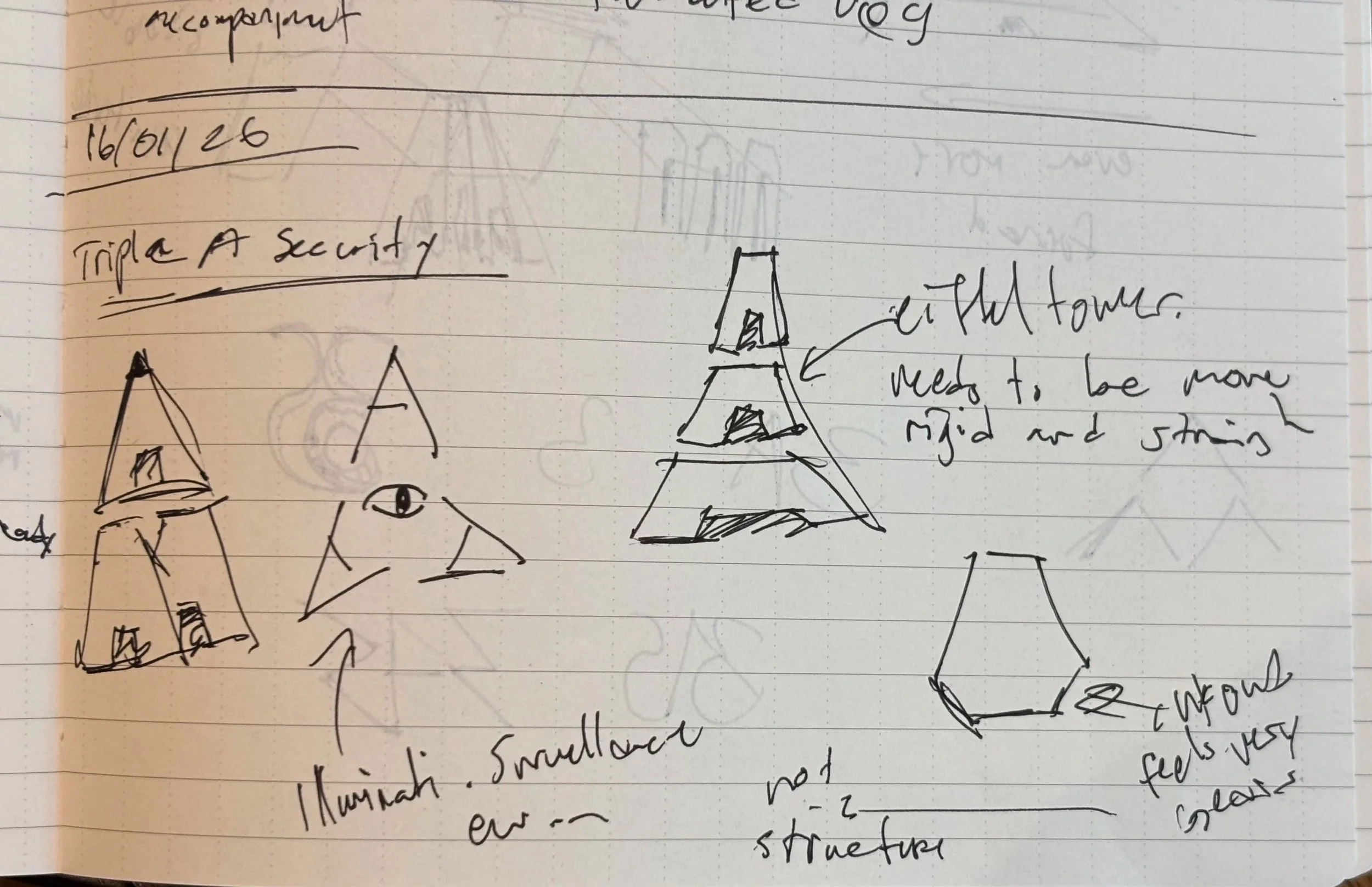
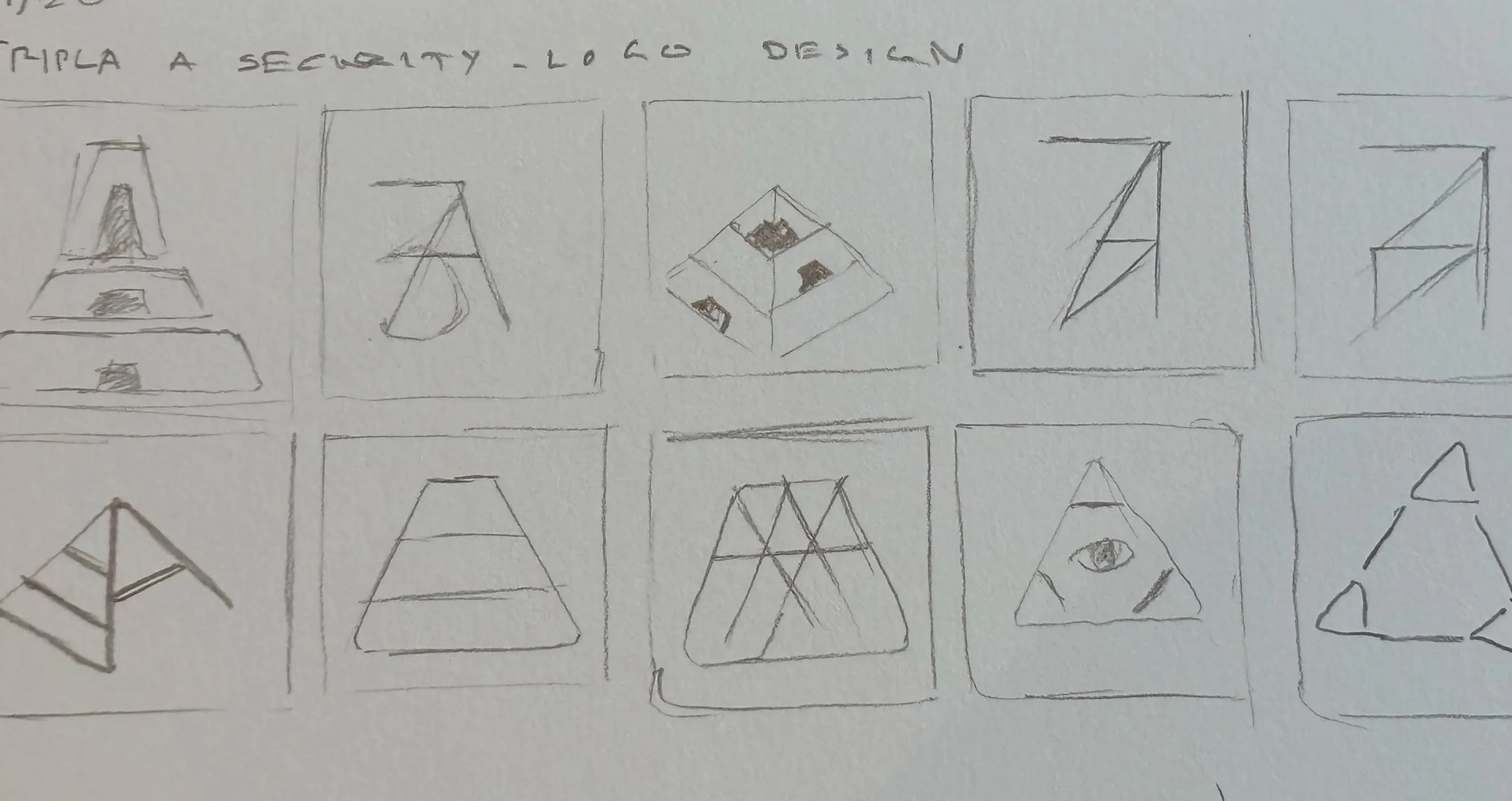
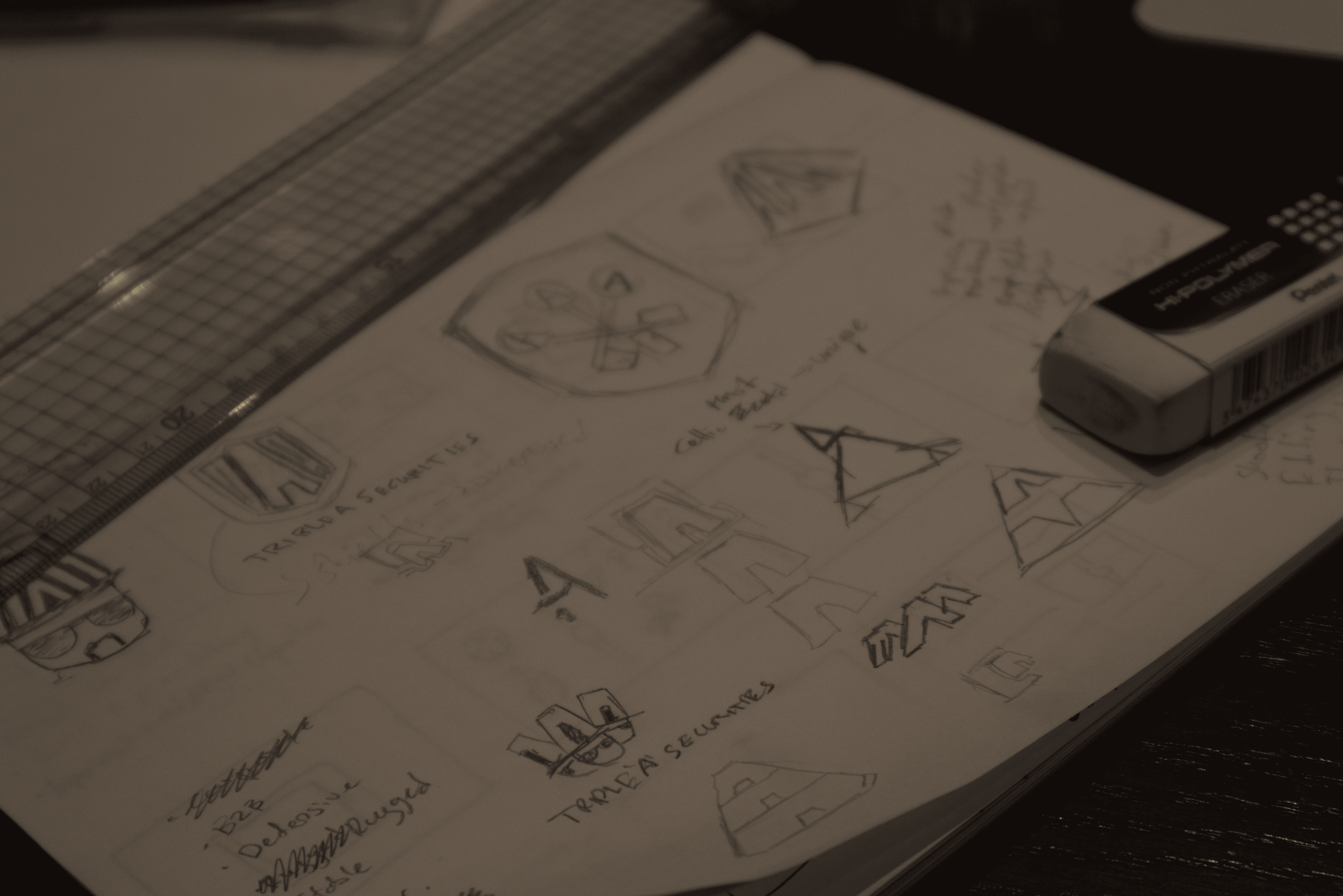
Various different options arose during the ideation phase, but patterns did pop up. A commonality are the triangular and letter ‘A’ silhouettes.
Final Design
Equilateral Triangle, Pyramid-like silhouette
Nuance of ‘3s’ in the 3 segments and triangle
I have opted to go for a triangular silhouette due to triangles being perceived as a stable and robust shape. The shape of the equilateral triangle further adds to the rigidity. Since it is a geometric shape, it is repeatable and scalable. It stands out amongst other security companies due to many of them opting for a shield, eye, or key silhouette.
The triangle is segmented in 3 parts to signify the three domains in which Triple-A Security operates in, with cutouts the mimic the shape of the letter ‘A’. This leads to a silhouette of a pyramid, which signifies stability and longevity.
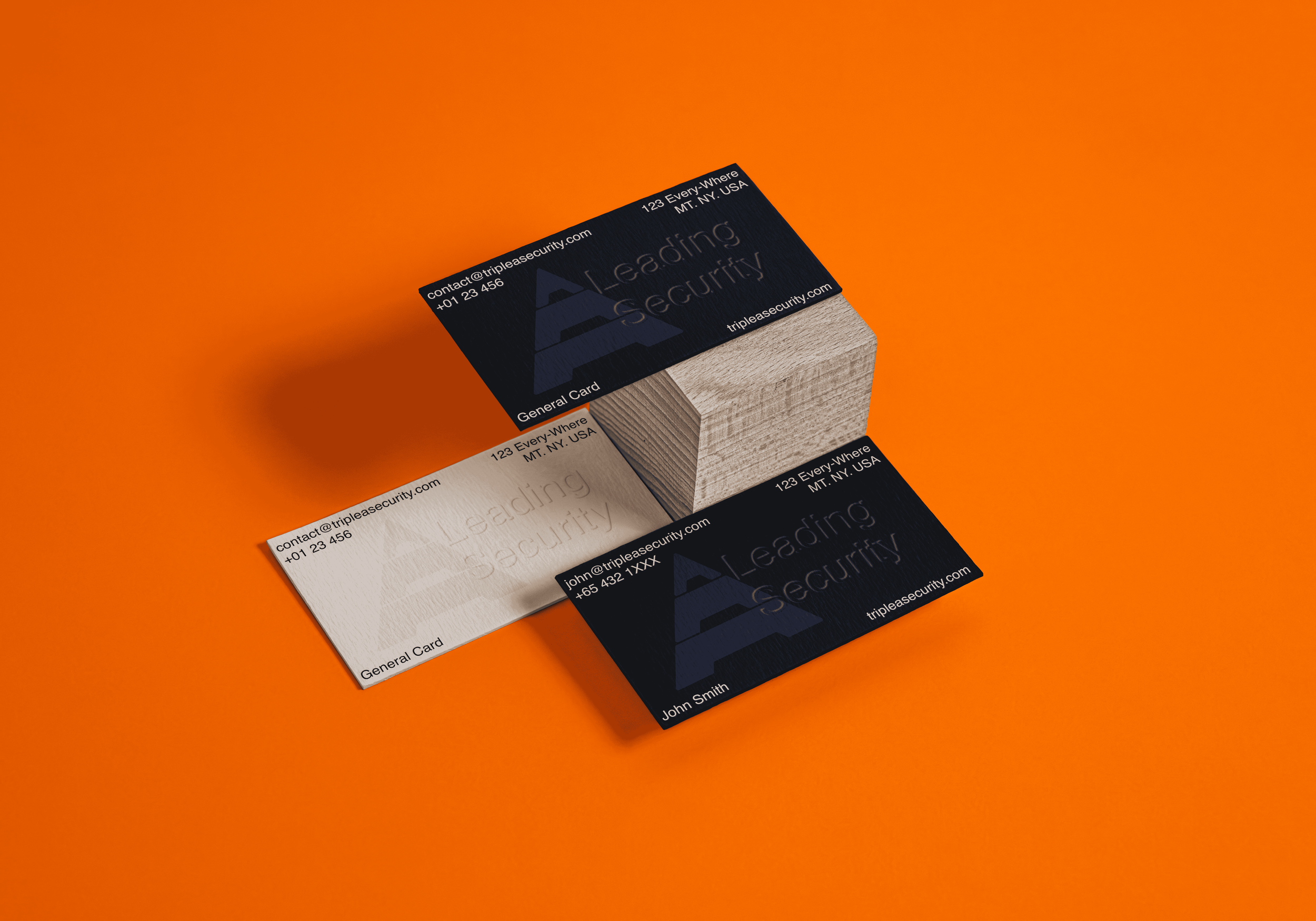
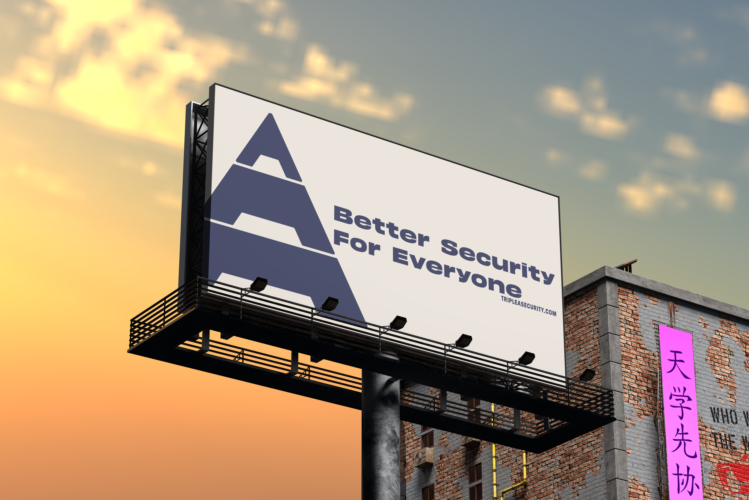
Mockups